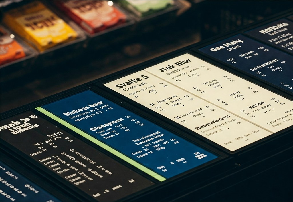
As a convenience store owner/operator, you understand the importance of making every moment count for your customers. From grabbing a quick snack to fueling up, every interaction should be seamless and efficient. One often overlooked aspect of this experience is the menu board. A well-designed menu board can enhance customer satisfaction, streamline ordering, and even boost sales. At the heart of an effective menu board is a thoughtful color scheme that ensures readability and visual appeal. Here are the top 5 color combinations that can elevate your menu board game:
Top 5 Color Combinations for Readability
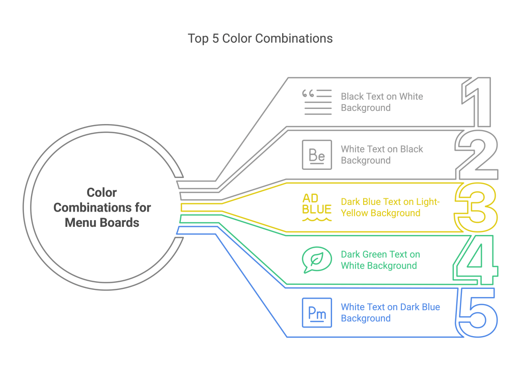
- Black Text on a White Background: The Unbeatable Classic. You can’t go wrong with this one! It’s the gold standard for a reason – maximum contrast means customers can quickly scan and see exactly what you’re offering, even from a bit of a distance. Clean, simple, and always professional.
- White Text on a Black Background: Sleek and Modern. Want a menu board that looks sharp and up to date? This combo delivers. It’s super readable, but keep in mind that for very long lists, some folks find black on white a tad easier on the eyes. This works great for highlighting specific sections or daily specials!
- Dark Blue Text on a Light-Yellow Background: Eye-Catching for Deals! Need to shout about a limited time offer or a customer favorite? This combo is your secret weapon! The bright yellow background is a natural attention-grabber, and dark blue text offers excellent readability for those can’t-miss promotions.
- Dark Green Text on a White Background: Fresh and Easy on the Go. If you’re promoting healthier snacks or grab-and-go meals, this color scheme aligns perfectly. It feels fresh and natural, and the dark green on white is super easy for customers to read when they’re making a quick decision.
- White Text on a Dark Blue Background: A Calming and Clear Choice. While convenience stores are often bustling, a dark blue background can offer a sense of calm and reliability. Paired with white text, it’s a clear and professional look that’s easy for customers to digest quickly.
Key Considerations for Readability
- High Contrast is King: The most important factor is ensuring a significant difference in luminance between the text and background colors. This ensures that your menu is readable from a distance.
- Say No to Blending In: Don’t use colors that are too close in tone, as this will make the text difficult to read.
- Work Your Brand (Smartly): Absolutely bring in your brand colors! Maybe use them for borders, headings, or to highlight specific sections. Just make sure they enhance readability, not hinder it.
- Quick Readability Test: Ask a few employees or even regular customers to take a quick look at your proposed menu board. Can they easily read it? Their feedback is gold!
- Font Matters Too! Stick to clean, simple fonts (think Arial, Calibri, or even your brand’s font if it’s easy to read). And for goodness’ sake, make the text big enough! No one wants to squint to figure out what you’re selling.
Conclusion: Elevate Your Menu Board Experience
Crafting the perfect menu board is more than just choosing colors; it’s about creating an experience that resonates with your customers. Selecting a color combination that balances readability with visual appeal can enhance customer satisfaction and streamline the ordering process. Whether you opt for a classic black and white or something more vibrant like dark blue and yellow, remember that the goal is to make every interaction with your menu board seamless and enjoyable. Test your design thoroughly. Incorporate your brand identity thoughtfully. See how a well-designed menu board can transform your convenience store into a hub of efficiency. Your store can also become a center of customer delight.
Sources:
- https://www.aiscreen.io/blog/restaurant/effective-use-of-colors-and-typography-on-digital-menu-boards/
- https://pmc.ncbi.nlm.nih.gov/articles/PMC9185210/
- https://www.crowntv-us.com/blog/create-attractive-digital-menu-boards/
- https://www.tailorbrands.com/blog/logo-color-combinations
- https://www.jameshoggdisplay.digital/blogs/news/digital-menu-boards-what-colours-work-well
- https://accessibility.huit.harvard.edu/use-sufficient-color-contrast
- https://www.touchbistro.com/blog/restaurant-menu-design/
- https://looka.com/blog/color-combinations/
- https://businesssignsandmore.com/blogs/signs-of-success/design-tips-for-the-perfect-menu-board-sign-display
- https://www.majesticsignstudio.com/blog/best-color-combinations-for-readability/


Leave a comment