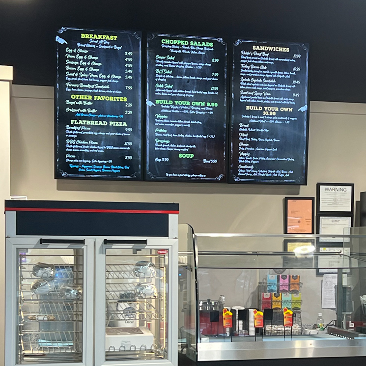
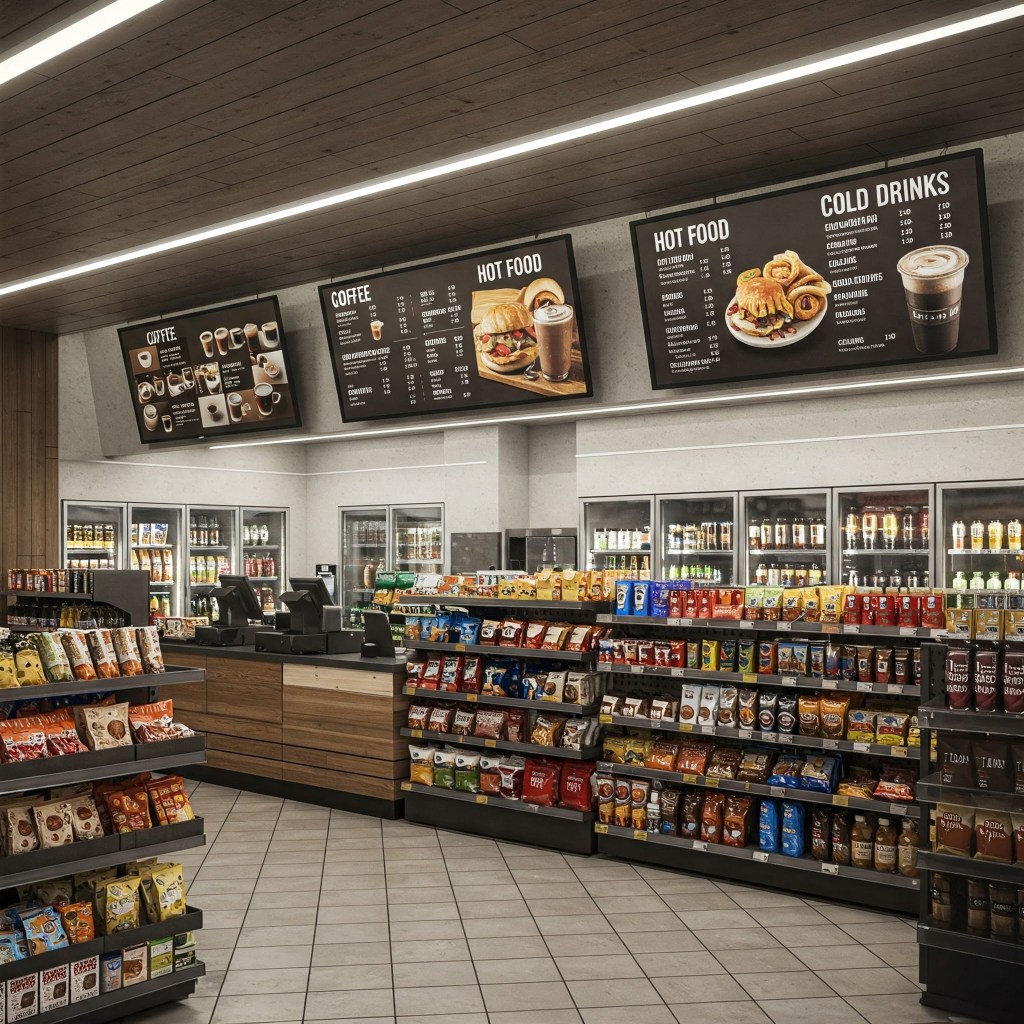
In convenience stores, every second counts when you’re trying to grab your customer’s attention. They’re on the go, and need to make quick decisions. That’s why your static menu board isn’t only a list of products – it’s a crucial tool for driving sales and enhancing the customer experience. But what’s the secret to a menu that grabs attention and delivers information immediately? It’s all in the fonts.
Choosing the right typography can transform your menu from a mere display into a powerful sales engine. Today, we’re diving into the top 5 fonts that convenience store owners and operators should be using to create menu boards that are both visually appealing and highly effective. Get ready to discover the fonts that will make your menu pop and your customers happy.
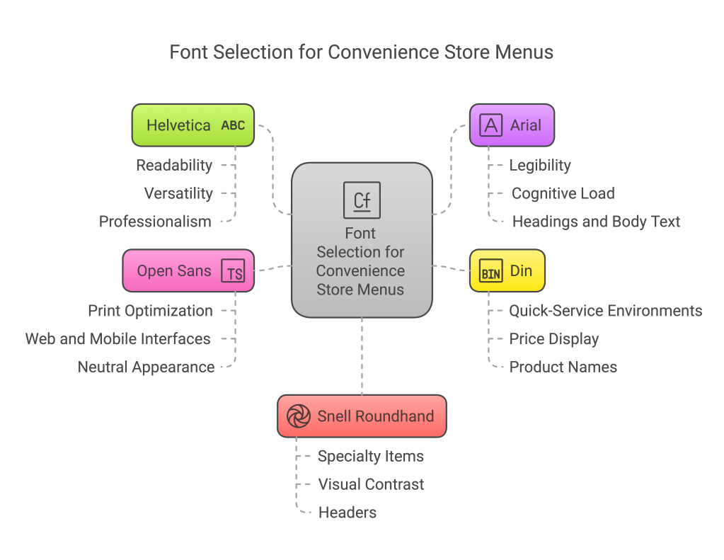
The Top 5 Fonts For Menu Boards:
- Helvetica
- Clean and simple design for easy readability
- Versatile for various menu items and prices
- Professional appearance that suits most convenience store settings
- Arial
- Highly legible, even at smaller sizes
- Familiar to most customers, reducing cognitive load
- Works well for both headings and body text
- Din
- Clear and concise, ideal for quick service environments
- Modern look that fits well with convenience store aesthetics
- Effective for displaying prices and product names
- Open Sans
- Optimized for print, web, and mobile interfaces
- Neutral yet friendly appearance
- Excellent readability from a distance
- Snell Roundhand
- Adds a touch of elegance to certain menu items (e.g. specialty coffee or fresh food offerings)
- Can be used sparingly for headers or to highlight special products
- Creates visual interest and contrast when paired with sans-serif fonts
When selecting fonts for static menu boards, convenience store owners should prioritize readability, consistency with their brand image, and the ability to display clearly from a distance. It’s often effective to use a combination of these fonts, such as a sans-serif option like Helvetica or Arial for the main text, paired with a more stylized font like Snell Roundhand for headers or special items.
Remember to test the chosen fonts in the actual store environment to ensure they are easily readable under various lighting conditions and from different angles. Additionally, consider the overall design of the menu board, including color scheme and layout, to create a cohesive and appealing visual presentation for customers.
There you have it – the top 5 fonts that can revolutionize your convenience store’s static menu boards.
From the clean simplicity of Helvetica to the elegant touch of Snell Roundhand, each of these fonts brings something unique to the table. But remember, a great menu is more than just pretty letters – it’s about clear communication, brand consistency, and making those quick, impactful sales.
Don’t let outdated or hard-to-read fonts hold your business back. The clock is ticking, and every moment a customer struggles to read your menu is a potential lost sale. Take action now! Implement these font suggestions, and watch your menu become a powerful asset in your convenience store. Your customers – and your bottom line – will thank you.
Sources:
- https://creativemarket.com/blog/best-fonts-for-menu-boards
- https://www.dotit.com/blog/best-fonts-for-restaurant-menu-boards.html
- https://www.aiscreen.io/blog/restaurant/effective-use-of-colors-and-typography-on-digital-menu-boards/
- https://www.wasserstrom.com/blog/2023/03/27/best-menu-fonts/
- https://graphicdesign.stackexchange.com/questions/86513/wall-menu-font-size-and-type-recommendation


Leave a comment