(Or, Operational Efficiency and Growth in Convenience Stores: Optimizing Store Layout and Signage for Enhanced Customer Satisfaction and Impulse Purchases)
Part 1 of 4
Ever walked into a convenience store and felt instantly at ease, effortlessly finding what you needed (and maybe a few things you didn’t know you needed)? Or have you experienced the opposite – a confusing maze that leaves you frustrated and ready to bolt? The difference often boils down to one critical element: store layout.
For convenience store owners, the layout isn’t just about arranging shelves; it’s a powerful tool that directly impacts customer satisfaction, encourages those valuable impulse purchases, and ultimately, drives your bottom line. In fact, strategic store layout and design can boost sales by up to 20%! A well-planned interior is truly a powerful engine for driving sales and customer loyalty.
This post is the first in our four-part series on Operational Efficiency and Growth in Convenience Stores. We’re diving deep into optimizing your space to enhance the customer experience and encourage impulse buys. Today, we lay the groundwork by exploring the fundamental principles – the foundations – of creating an efficient and effective store layout.
1. Understanding Your Blueprint: Store Layout Types
Think of your store layout as a silent salesperson. It guides customer behavior, influences purchasing decisions, and shapes the overall shopping experience. There’s no one-size-fits-all solution, and the ideal layout depends on your store’s size, product range, and customer traffic patterns. Choosing the right layout is crucial for maximizing sales. Here’s a breakdown of common types relevant to convenience stores:
- Grid Layout: This classic layout uses parallel aisles and right angles. It’s highly efficient for maximizing shelf space and works well for stores with a wide variety of products. Customers can easily navigate and find specific items. It’s considered ideal for smaller spaces with high inventory. While efficient, the design should avoid creating a monotonous shopping experience.
- Loop (Racetrack) Layout: This design guides customers along a predetermined path, often a loop around the store’s perimeter. It’s excellent for exposing shoppers to a broader range of products, increasing the likelihood of discovery and significantly encouraging impulse purchases. Convenience stores often use this to guide customers through a set path.
- Free-Flow Layout: Less structured, this layout arranges products in clusters. It creates a more relaxed and inviting atmosphere, encouraging browsing and discovery. This is less common in typical convenience stores but can be used for specific sections to create a curated experience.
- Herringbone Layout: Optimized for long, narrow spaces, this layout uses angled aisles to ensure efficient use of limited areas and maximize shelving.
- Diagonal Layout: Angled aisles can create a less rigid, more visually appealing feel than a grid, potentially improving visibility and encouraging browsing.
- Forced-Path Layout: This directs customers along a specific route, often past key product categories or promotional displays. It’s highly effective for maximizing exposure to specific items.
Ultimately, the best layout for a convenience store depends on your specific needs, but it should always increase customer convenience and product visibility.
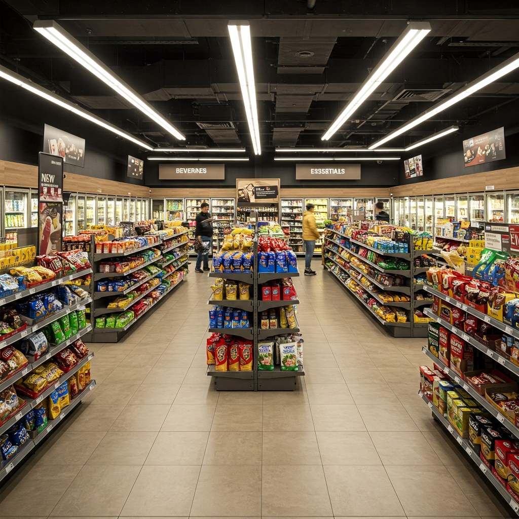
2. Navigating for Success: Customer Flow and Accessibility
Imagine your store as a highway; you want smooth traffic flow, not a rush-hour bottleneck. An efficient layout prioritizes easy navigation and minimizes congestion. Understanding consumer psychology is the first step. Shoppers are guided by visual cues that influence their path.
- Strategic Placement: Place high-demand items (like beverages or snacks) at the back of the store. This encourages customers to walk through the entire space, exposing them to other enticing products along the way and increasing the chances of impulse purchases. Clear and welcoming entry and exit points also set the tone for a smooth experience.
- Aisle Spacing: Ensure aisles are wide enough for comfortable movement, especially during peak hours. Nobody wants to feel like they’re navigating an obstacle course. Adequate spacing minimizes congestion and improves navigation. Ensure all areas are easy to navigate, with ramps and wide aisles for visitors with disabilities, prioritizing accessibility.
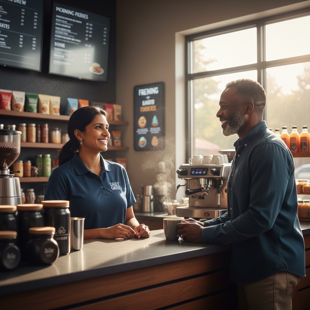
- Logical Adjacencies: Group related products together. For example, placing coffee near pastries or chips near soda makes intuitive sense to customers. Grouping complementary items not only aids in finding products but also encourages additional purchases, significantly improving the overall shopping experience.
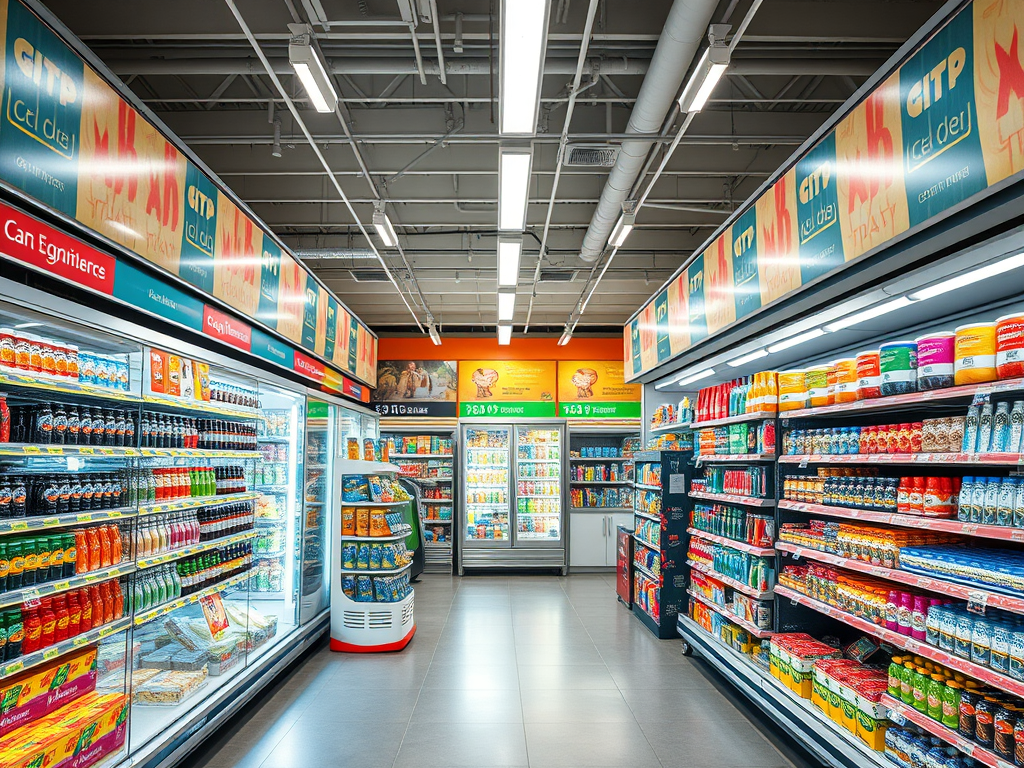
3. Products in the Spotlight: Visibility and Basic Merchandising
Think of your products as actors on a stage; you want to showcase them in the best possible light. Optimizing product visibility is key to driving sales.
- Eye-Level Advantage: Items placed at eye level get the most attention and are more likely to be purchased. This is prime real estate! Placing products within the eye-level to waist-level range is comfortable for most customers and enhances the shopping experience.
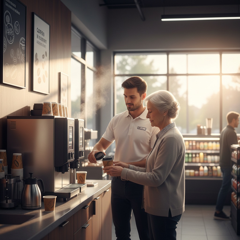
- End Caps and Checkout Displays: These are your “power zones” for promotional and impulse items. Endcaps, at the end of aisles, stand out from regular displays and are locations where customers are more likely to make spontaneous decisions. Use the checkout area, near the counter, to encourage last-minute purchases of high-margin, small items like snacks or batteries.
- Cross-Merchandising: Display complementary products together to increase the chance of impulse purchases. If you sell wine, you might place cheese and crackers nearby. This encourages unplanned purchases as customers see items that pair well with their original selection.
- Seasonal and Trend-Based Displays: Planograms can be easily adjusted to align with seasons and trends. Incorporating trending or seasonal items into your layout, perhaps in focal points or temperature-controlled sections, can stimulate customer interest and motivate impulse buys, especially for limited-time offers. Regularly updating your planogram strategy in response to seasonal trends is crucial.
- Lighting: Lighting is incredibly powerful. Combine ambient, task, and accent lighting. Use lighting to highlight key products, create ambiance, and direct customer focus. For example, adjusting lighting in refrigerated sections can draw attention to cold beverages in summer. Upgrading to LED lighting has even been shown to result in significant sales increases.
- Color Schemes: Colors influence shopper decisions and evoke emotions. Warm colors like red and yellow stimulate appetite and encourage impulse purchases, making them perfect for snack and beverage sections. Cool tones can create a calming atmosphere. Strategically using lighting and colors can boost sales.
4. The Science Behind the Shelves: The Role of Planograms
Once you have your layout strategy, how do you ensure it’s executed consistently? Enter planograms. A planogram is a visual representation or diagram that outlines the specific placement and arrangement of products on store shelves or displays.
Planograms are essential tools for maintaining consistency across multiple store locations or even different shifts within the same store. They are a strategic tool to enhance the shopping journey.
- Optimize Shelf Space: Planograms help you make the most of your available space, ensuring products are displayed effectively. They meticulously organize store layouts and maximize space utilization.
- Align with Sales Data: Use planograms to place products based on sales performance, maximizing revenue. Analyzing purchase data helps determine which products are frequently bought together, informing strategic placement.
- Ensure Consistency and Efficiency: Digital planogramming tools can offer real-time updates and facilitate training and compliance among staff. They are key for quick and efficient planogramming with minimal effort. Tools exist that allow designing store-specific planograms for increased product visibility and sales and multi-device compatibility for accessibility.
- Adaptability: Planograms are instrumental in adapting store layouts to changing customer preferences, seasons, and trends.
By precisely defining where each product belongs, planograms help optimize product visibility, enhance the shopping experience, and drive sales.
5. The Final Impression: The Checkout one
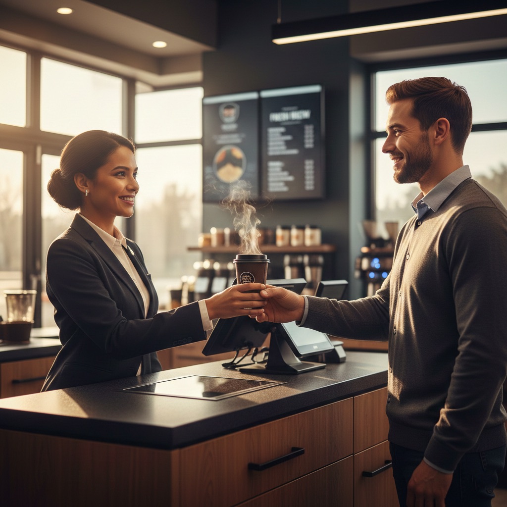
The checkout area is your last chance to make a positive impression (and grab a few extra sales). Its placement is crucial for maximizing effectiveness.
- Minimize Wait Times: No one likes waiting in line. An efficient checkout design is crucial for customer satisfaction.
- Impulse Item Displays: Strategically placed snacks, beverages, and other small, high-margin items near the counter can significantly boost average transaction value. Use visual merchandising concepts here.
- Self-Checkout Options: Offering self-checkout caters to customers seeking speed and convenience. Integrating these systems offers a fast and convenient way to complete purchases and can encourage impulse purchases. Placing them in easily accessible, high-visibility areas near the exit, but also close enough to impulse items, is ideal. This can also free up valuable retail space for additional product displays.
The Bottom Line – Setting the Stage for Success
An efficient store layout is more than just arranging shelves. It’s about understanding customer behavior and optimizing product placement. It’s also about creating a seamless and intuitive shopping experience that enhances customer satisfaction and loyalty. By focusing on these foundational principles – choosing the right layout, designing for flow and accessibility, maximizing product visibility through smart merchandising and planograms, and optimizing your checkout zone – you can transform your convenience store into a customer-friendly and revenue-generating machine. Regularly reviewing and adapting your layout based on customer feedback and data analysis is key to staying ahead.
But layout is just one piece of the puzzle. To truly maximize your store’s potential, you need to effectively guide and attract customers to and through your store. That’s where signage comes in. In our next post, “Signage Strategies for Attracting and Guiding Customers” (coming on Wednesday!), we’ll explore how strategic signage complements your layout, enhances visibility, drives traffic, and boosts sales.
Until then, keep thinking about how your layout is speaking to your customers!


Leave a comment