
How Spatial Engineering Drives Every Dollar
In our previous deep dive, Part 2: The Psychology of the First 90 Seconds, we explored the “vibe”, those critical sensory cues like lighting, aroma, and cleanliness that hook a customer the moment they step through your door. We establishedthat if the atmosphere doesn’t feel right, the customer’s brain flips a “flight” switch. But once you’ve won their trust in those first 90 seconds, where do they go next?
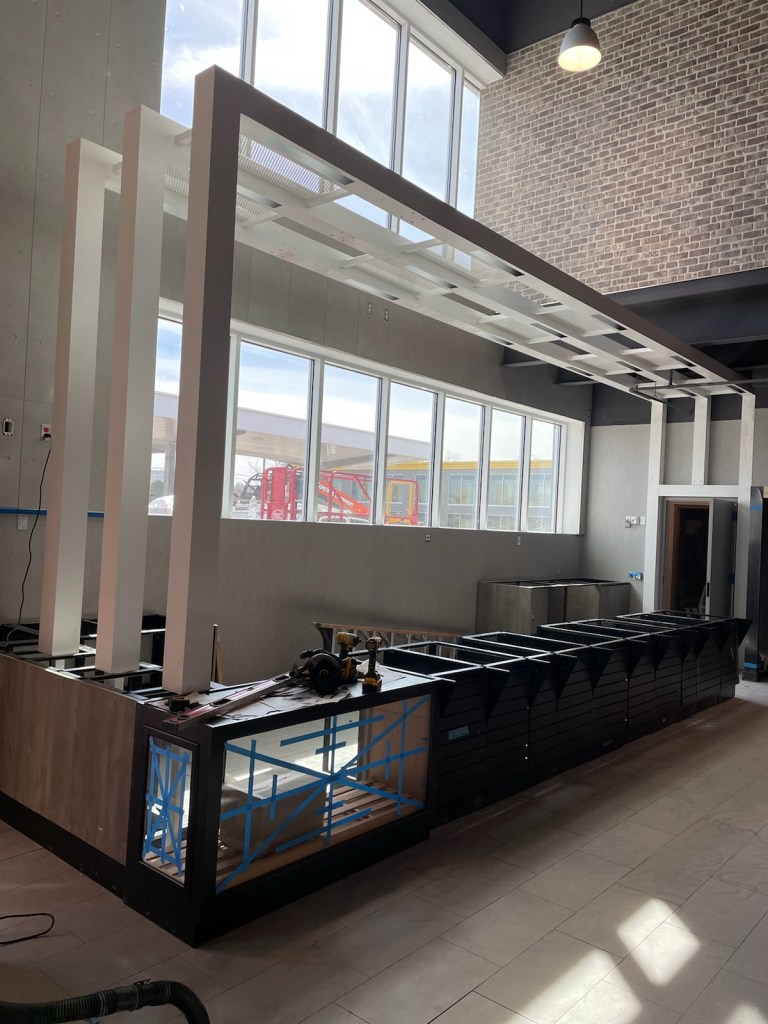
That is the trillion-dollar question in retail. As an expert who works daily with cabinetry, equipment, and store flow, I can tell you that even the most stunning LED-lit pastry case is useless if it’s tucked in a “dead zone” where no one walks. This is where we move from the feeling of the store to the physics of the store. We call this Spatial Engineering.
Retail design is a literal science. Every square inch of your floor plan is a psychological trigger that either encourages a customer to explore or signals them to grab one item and bolt for the exit. My goal today is to help you stop looking at your store as a collection of shelves and start seeing it as a curated journey. If a path is cluttered, narrow, or confusing, the customer experiences “cognitive load”, basically, their brain gets tired of trying to navigate, so they leave.
However, when a store is engineered correctly, you aren’t “selling” to them anymore; you are simply guiding them toward high-margin profit centers they didn’t even know they wanted to visit. We’re talking about moving the needle on basket size by making the “unplanned purchase” the easiest part of their day.
In this post, we are going to break down the mechanics of the “Decompression Zone,” the biological reality of the “Right-Turn Bias,” and how to choose a layout that matches your specific business goals. By the end of this, you’ll have a blueprint to turn your floor plan into a high-performance sales engine.
The Decompression Zone and the “Right-Turn Bias”

The first five to fifteen feet of your store is what we call the Decompression Zone. This is the most critical transition point in the building. Your customer is coming in from a bright parking lot, perhaps frustrated by traffic or distracted by a phone call. They need a moment for their pupils to adjust and their brain to shift from “driving mode” to “shopping mode.”
I see many operators make the mistake of “cluttering the gate.” They cram massive cardboard standees, dump bins of windshield wiper fluid, or loud neon signs right at the door. From a psychological standpoint, this is a disaster. It causes “entry paralysis.” If you overwhelm a customer before they’ve even oriented themselves, they will subconsciously rush through the rest of the store just to get the “task” over with.
Once they pass through that zone, something fascinating happens. Due to what researchers call the “Invariant Right”, approximately 90% of North American shoppers will instinctively turn their gaze and then their body to the right. This isn’tjust a quirk; it’s a retail law.
Why the Right Wall is Your “Power Wall”
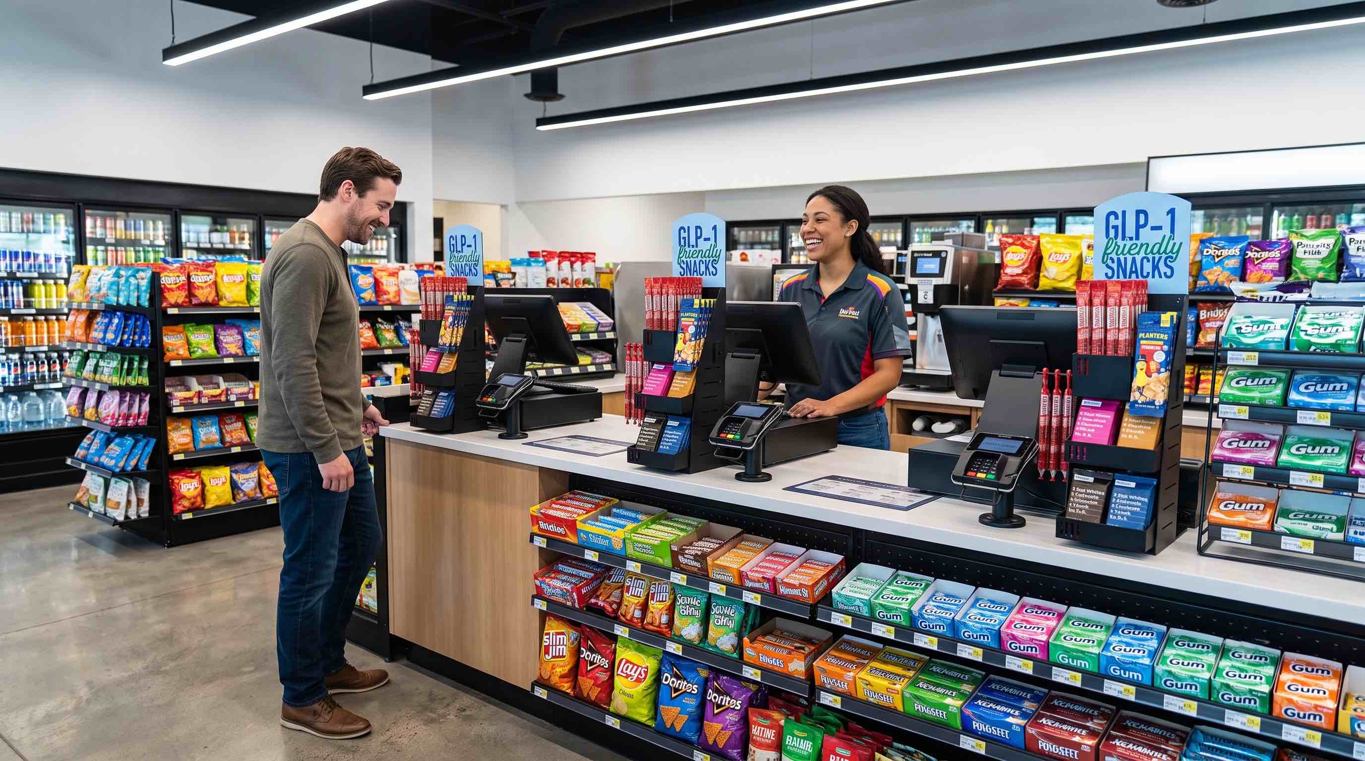
Because of this natural drift, the right side of your store is your highest-value real estate. This is where your brand identity is solidified and where your highest-margin items, like your gourmet coffee program or your fresh bakery cases, should live. Never waste this space on “staples” like gallon milk or motor oil. People will hunt for milk because they need it; they will buy a $5 high-end protein snack because they saw it on the Power Wall.
Choosing the Right Layout for Your Mission
Your layout shouldn’t just be “how the shelves fit.” It should be a reflection of the mission you want your customers to complete. Depending on your footprint and your demographic, one of these three primary layouts will likely be your winner:
1. The Grid Layout
This is the classic “grocery style” with parallel aisles.
- The Pro: It is incredibly efficient. “Mission shoppers” who want a specific energy drink and a pack of gum love this because they can predict where everything is.
- The Con: It feels clinical. It doesn’t encourage “browsing,” and it can create “dead ends” if not managed properly.
2. The Loop (Racetrack) Layout

This layout creates a clearly defined path that leads customers from the entrance, around the entire perimeter, and back to the registers.
- The Pro: This is the gold standard for increasing “dwell time.” It exposes the customer to every single category you have.
- The Con: It requires a larger footprint and strategic “internal” displays so the center of the store doesn’t feel like a void.
The Spine Layout
A single main aisle runs from the front to the back, with departments or “zones” branching off like ribs.
- The Pro: It’s excellent for mid-sized stores that want a “boutique” feel. It allows you to create specialized “destinations” (like a dedicated “Beer Cave” or a “Hot Food Zone”) without losing the customer in a maze.
Vertical Merchandising: The “Eye-Level” Rule

As a cabinetry specialist, I always tell my clients: “Eye level is buy level.” This isn’t just a catchy phrase; it’s backed by decades of eye-tracking data. Products placed in the “bulls-eye zone”, roughly 59 to 66 inches high, receive significantly more engagement than items on the bottom shelf.
However, there is a catch. If your shelving is too high throughout the store (over 60 inches), you kill the line of sight. Customers feel claustrophobic, and from a loss-prevention standpoint, it’s a nightmare. I recommend keeping center-store shelving below 54 inches. This creates an open, airy feeling that makes the store look larger and safer, which actually encourages people to stay longer.
What You Should Be Doing
To turn these insights into immediate sales growth, here is your action plan:
- Audit Your Entrance: Stand at your front door. If you can’t see the back of the store because of “clutter” in the first ten feet, move it. Create a clear “Decompression Zone” that allows the customer to breathe and orient themselves.
- Optimize the “Power Wall”: Look at what is currently to the right of your entrance. Is it a rack of cheap maps or a dusty floor mat? Replace it with your highest margin, most visually appealing category (e.g., a modern coffee bar or premium snacks).
- Measure Your Aisles: Ensure your main paths are at least 48 to 60 inches wide. Anything narrower leads to “Butt-Brush Syndrome”, a documented phenomenon where shoppers (especially women) will leave an aisle immediately if they are bumped from behind.
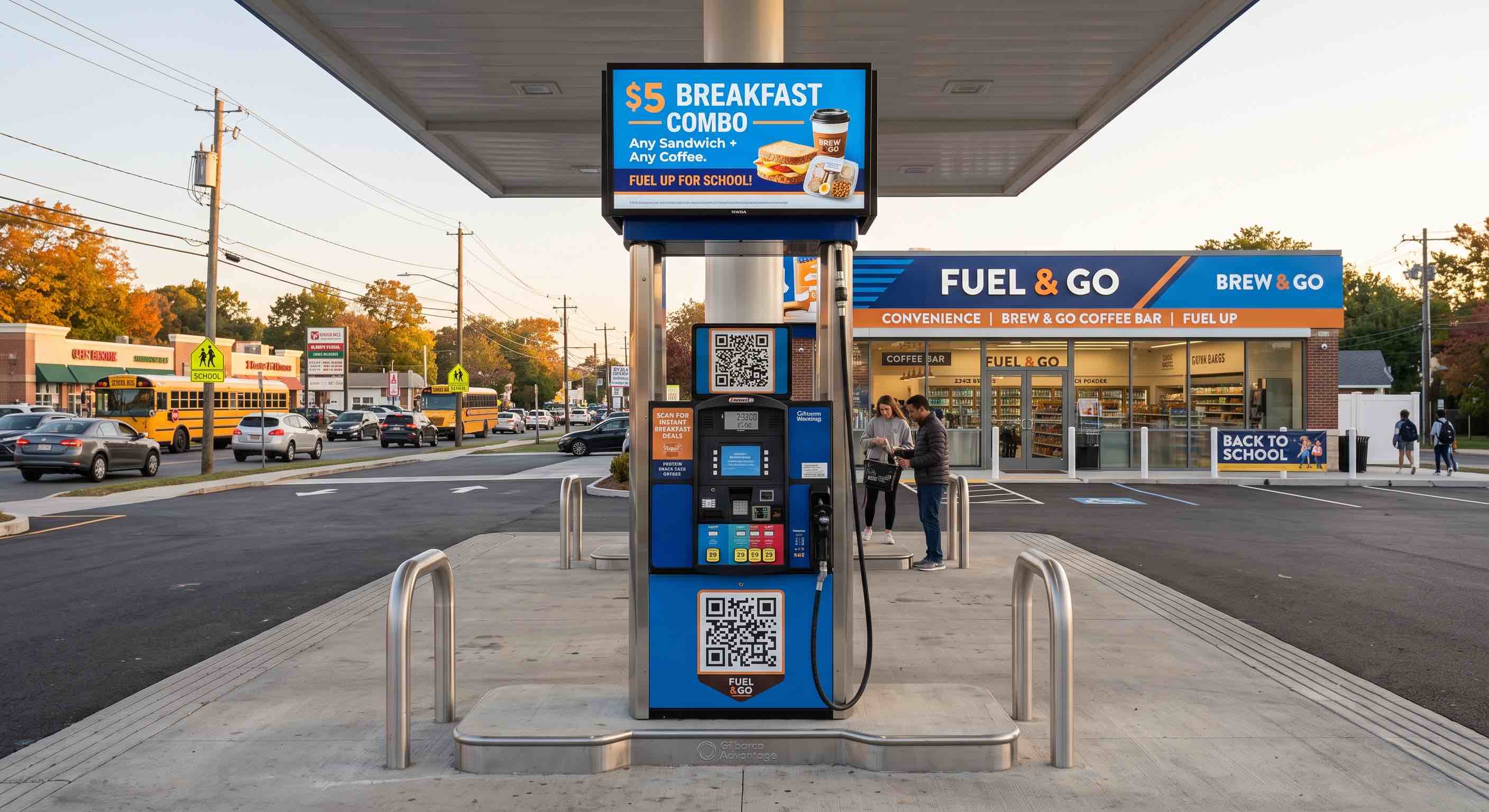
- Leverage Your Endcaps: Treat your endcaps like billboards. Use them for “bundle deals” (e.g., a salty snack and a 20oz soda) or seasonal “viral” items. A well-executed endcap can drive a 20-30% lift in impulse sales for those specific items.
- Check Your Sightlines: Stand in the corner of your store. Can you see the cashier? Can you see the coffee area? If your cabinetry is blocking these views, you are losing “cross-selling” opportunities.
The Bottom Line: The People in the Path
At the end of the day, spatial engineering is about making the shopping experience “frictionless.” When we reduce the physical and mental effort required to navigate your store, we increase the likelihood of those unplanned purchases that account for a staggering 73% of all convenience store sales.
But remember, a “shopper” isn’t a generic entity. A 20-year-old looking for a viral “TikTok snack” navigates a space very differently than a 55-year-old stopping for a morning coffee and a newspaper. To master your floor plan, you must understand who is walking the path.
In our next post, Part 4: The Generational Handshake: Tailoring Your Store for Gen X, Millennials, and Gen Z, we’re going to look at the “who.” We’ll discuss why Gen Z craves a “vibe-first” environment with customizable options, while Gen X values speed, stock reliability, and a frictionless “in-and-out” experience. Understanding these generational nuances is the final piece of the puzzle in mastering your product mix.
I’ll see you in Post 4!
Want the ‘Sensory Engineering’ infographic in a printable PDF? Leave me a comment and I’ll reach out. Stay tuned for the rest of the series.


Leave a Reply